Chapter 14 of 16
← All workFood importer · Brand and social strategy · Saudi Arabia
VitaJoy: a lighter choice with the same joy
VitaJoy is a Saudi food importer carrying four imported brands: &JOY nut and protein bars, tivva gluten-free corn pasta, GOLD diet chocolate and Assugrin diet jelly and sweeteners. The packaging is Brazilian with Portuguese text, so the product itself is the hero, not the box. The commercial goal shaped the whole plan: when the brief was written, the jelly was 60% of the stock and four months from expiry, so as much of it as possible had to sell within eight weeks.
8 weeks to clear it
All numbers
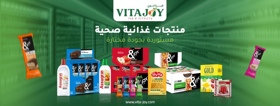 Four brands on one shelf
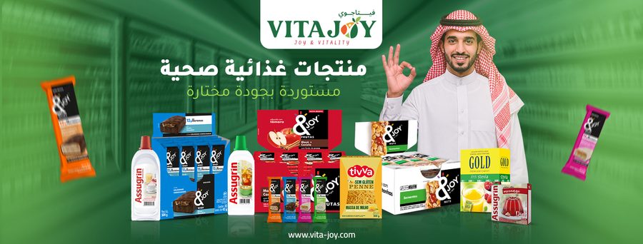 A person next to the products
 Same shelf, LinkedIn size
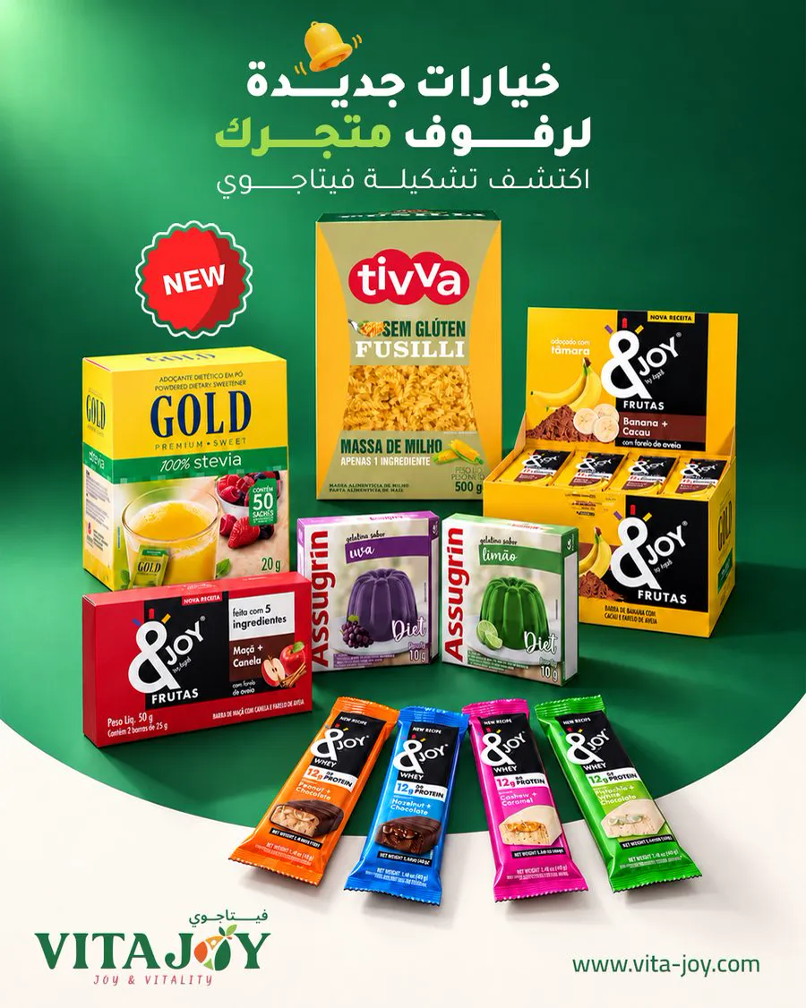 New options for retail shelves
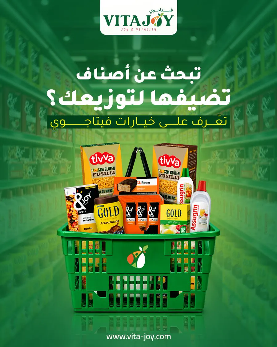 Speaks to distributors
 Logo in Arabic and English
 Highlight icon: about us
 Highlight icon: B2B
 Highlight icon: FAQ
 Highlight icon: location
The deadline
Eight weeks to clear it.
The story in 4 steps
- 60%of
Where it started
VitaJoy is a Saudi food importer with four imported brands.
More
When the brief was written, its diet jelly was 60% of the stock, four months from expiry.
What was in the way
The brief gave eight weeks to clear it, Brazilian packaging in Portuguese, and the belief that lighter means boring.
The move
A creative platform, #NoCompromise, and a tone of voice written as rules a copywriter can follow, with banned claims.
More
50 to 60% of content and budget went to the jelly.
What I delivered
A written strategy and brief, a 30-day content plan, a November LinkedIn calendar with copy, a references book and the social identity: covers, profile images and six highlight icons.
Step 1 of 3
The covers
2Bside
A Facebook cover with the product line, a second with more personality, and a LinkedIn cover for the B2B side.
Four brands on one shelfA person next to the productsSame shelf, LinkedIn size- A written strategy and a brief that turns the tone of voice into rules a copywriter can follow, with banned claims (no invented numbers, ingredients, prices or health claims).
- 30A 30-day content plan, a November LinkedIn calendar with ready copy, a references book and a plan to set up and unify the brand's accounts.
- 2Social identitytwo Facebook covers, profile images, six highlight icons (about us, B2B, FAQ, location, products, contact), launch posts and a LinkedIn cover.
- Video captions for the first batch of reels.
Step 2 of 3
The launch posts
New options for the shelf, and the basket: two posts that introduce the range.
New options for retail shelvesSpeaks to distributorsStep 3 of 3
Profile and highlights
A profile image and six highlight icons: about us, B2B, FAQ, location, products and contact.
Logo in Arabic and EnglishHighlight icon: about usHighlight icon: B2BHighlight icon: FAQHighlight icon: location Highlight icon: products
 Highlight icon: contact
More from this account 2 sections · 04 to 05
04Positioning
The enemy is the belief that "lighter means boring" and "diet means deprivation". The promise: a lighter choice with the same pleasure, small everyday wins. The creative platform is #NoCompromise, with a campaign line under it for each product: "the 6-calorie dessert" for the jelly, "tastes like dessert and has 12 grams of protein" for the whey bar, "one plate for everyone" for the pasta and "winter warmth" for the chocolate.
05Tone of voice and brand assets
- A close friend with a light touch who knows the good alternatives, not a nutritionist who lectures.
- Smart with real numbers, never exaggerated, in a Saudi voice and dialect.
- Distinctive assets that repeat until people recognize the brand without the logo: the green background, a jelly-wobble shot, a crunch sound for bars, an on-screen timer, a big number on screen and a fixed closing line.
- Every idea runs in one orderperson, moment, hook, benefit with a number, feeling, WhatsApp call to action.
 ← All work